Presentation Graphics
All the "camembert" things (or more well known in English as "pie chart", bar chart ....)
Extract from http://erc.msh.org/quality/foutools/foubrgrf.cfm
| Name | Example | What is it? | Why use it? | When to use it? |
|---|---|---|---|---|
| Pie Chart | 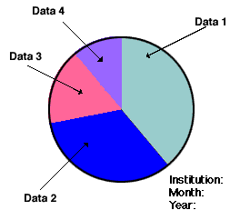 |
A pie chart is a tool that helps you visualise the relative importance
of several categories of a variable. |
To provide a rapid, graphical overview of data you have collected, such
as information about different types of users, types of treatments, types of methods, etc. |
When you have collected some data (for example, a counting of events or
a distribution of values) and you want to graphically depict the data |
| Bar Graph | 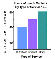 |
A bar graph is used to graphically present data that you have gathered.
The type of data represented in a bar graph is the number of occurrences measured in different categories of data. A bar graph is often used to graphically represent the information you have gathered in a table. For example, in the bar graph below, you can see a comparison of the number of users of different services -- outpatient, inpatient, and other -- by type of service. |
It helps you visualise relationships among different categories of factors
affecting services to the users. |
It is used when the information corresponds to a nominal scale (a counting
of occurrences), and when you want to compare two or more groups (no more than six). |
| Histogram |  |
A histogram is a diagram that graphically depicts the variability in a
process or procedure within your agency. When you want to see how a procedure is working in your organisation, you can gather data about that procedure (such as the amount of time the procedure takes) and create a histogram. The histogram allows you to see the variation in the amount of time it takes to do that process. |
Discovering and displaying this variation will greatly increase the team's
knowledge about a process. |
When you want to see the pattern of variation of a particular process,
such as when you are describing a problem, or during data collection and analysis. |
| Line Graph | 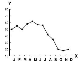 |
A line graph is a type of graph that represents data or sets of data that
have been collected over a period of time. The data are plotted on a graph corresponding to standard intervals of time, and a line is drawn connecting the data points. If updated regularly, line graphs help managers to follow a trend over a period of time and take actions to manage the trend. |
A line graph allows managers or team members to see trends in data (increase, decrease, or no change) over a period of time. This can be useful to help you visualise changes in the process over time or to let you compare the performance before and after the implementation of a solution. |
To visualise a process during a specific period of time to help you describe
a problem, or when you want to evaluate a solution to a problem. |